Visualising temporal trends
Introduction
Section titled “Introduction”This tutorial provides good practices regarding visualisation and interpretation of trends of indicators over time. The methods discussed here are more broadly applicable, be for this tutorial we focus on occurrence cubes from which biodiversity indicators are derived. For visualisation and interpretation, we strongly rely on the functionality and concepts of the effectclass package.
Calculating confidence intervals with dubicube
Section titled “Calculating confidence intervals with dubicube”We reuse the example introduced in bootstrap confidence interval calculation tutorial where we calculate confidence limits for the mean number of observations per grid cell per year for birds in Belgium between 2011 en 2020 using the MGRS grid at 10 km scale.
# Load packageslibrary(ggplot2)      # Data visualisationlibrary(dplyr)        # Data wranglinglibrary(tidyr)        # Data wrangling
# Data loading and processinglibrary(frictionless) # Load example datasetslibrary(b3gbi)        # Process occurrence cubeslibrary(dubicube)     # Analysis of data quality & indicator uncertainty
Loading and processing the data
Section titled “Loading and processing the data”We load the bird cube data from the b3data data package using frictionless (see also here).
# Read data packageb3data_package <- read_package(  "https://zenodo.org/records/15211029/files/datapackage.json")
# Load bird cube databird_cube_belgium <- read_resource(b3data_package, "bird_cube_belgium_mgrs10")head(bird_cube_belgium)#> # A tibble: 6 × 8#>    year mgrscode specieskey species           family           n mincoordinateuncertaintyinmeters familycount#>   <dbl> <chr>         <dbl> <chr>             <chr>        <dbl>                            <dbl>       <dbl>#> 1  2000 31UDS65     2473958 Perdix perdix     Phasianidae      1                             3536      261414#> 2  2000 31UDS65     2474156 Coturnix coturnix Phasianidae      1                             3536      261414#> 3  2000 31UDS65     2474377 Fulica atra       Rallidae         5                             1000      507437#> 4  2000 31UDS65     2475443 Merops apiaster   Meropidae        6                             1000        1655#> 5  2000 31UDS65     2480242 Vanellus vanellus Charadriidae     1                             3536      294808#> 6  2000 31UDS65     2480637 Accipiter nisus   Accipitridae     1                             3536      855924
We process the cube with b3gbi. First, we select 2000 random rows to make the dataset smaller. This is to reduce the computation time for this tutorial. We select the data from 2011 - 2020.
set.seed(123)
# Make dataset smallerrows <- sample(nrow(bird_cube_belgium), 2000)bird_cube_belgium <- bird_cube_belgium[rows, ]
# Process cubeprocessed_cube <- process_cube( bird_cube_belgium, first_year = 2011, last_year = 2020, cols_occurrences = "n")processed_cube#>#> Processed data cube for calculating biodiversity indicators#>#> Date Range: 2011 - 2020#> Single-resolution cube with cell size 10km ^2#> Number of cells: 242#> Grid reference system: mgrs#> Coordinate range:#> xmin xmax ymin ymax#> 280000 710000 5490000 5700000#>#> Total number of observations: 45143#> Number of species represented: 253#> Number of families represented: 57#>#> Kingdoms represented: Data not present#>#> First 10 rows of data (use n = to show more):#>#> # A tibble: 957 × 13#> year cellCode taxonKey scientificName family obs minCoordinateUncerta…¹ familyCount xcoord ycoord utmzone#> <dbl> <chr> <dbl> <chr> <chr> <dbl> <dbl> <dbl> <dbl> <dbl> <int>#> 1 2011 31UFS56 5231918 Cuculus canorus Cucul… 11 3536 67486 650000 5.66e6 31#> 2 2011 31UES28 5739317 Phoenicurus phoenic… Musci… 6 3536 610513 520000 5.68e6 31#> 3 2011 31UFS64 6065824 Chroicocephalus rid… Larid… 143 1000 2612978 660000 5.64e6 31#> 4 2011 31UFS96 2492576 Muscicapa striata Musci… 3 3536 610513 690000 5.66e6 31#> 5 2011 31UES04 5231198 Passer montanus Passe… 1 3536 175872 500000 5.64e6 31#> 6 2011 31UES85 5229493 Garrulus glandarius Corvi… 23 707 816442 580000 5.65e6 31#> 7 2011 31UES88 10124612 Anser anser x Brant… Anati… 1 100 2709975 580000 5.68e6 31#> 8 2011 31UES22 2481172 Larus marinus Larid… 8 1000 2612978 520000 5.62e6 31#> 9 2011 31UFS43 2481139 Larus argentatus Larid… 10 3536 2612978 640000 5.63e6 31#> 10 2011 31UFT00 9274012 Spatula querquedula Anati… 8 3536 2709975 600000 5.7 e6 31#> # ℹ 947 more rows#> # ℹ abbreviated name: ¹minCoordinateUncertaintyInMeters#> # ℹ 2 more variables: hemisphere <chr>, resolution <chr>Analysis of the data
Section titled “Analysis of the data”Let’s say we are interested in the mean number of observations per grid cell per year. We create a function to calculate this.
# Function to calculate statistic of interest# Mean observations per grid cell per yearmean_obs <- function(data) { data %>% dplyr::mutate(x = mean(obs), .by = "cellCode") %>% dplyr::summarise(diversity_val = mean(x), .by = "year") %>% as.data.frame()}We get the following results:
mean_obs(processed_cube$data)#> year diversity_val#> 1 2011 34.17777#> 2 2012 35.27201#> 3 2013 33.25581#> 4 2014 55.44160#> 5 2015 49.24754#> 6 2016 48.34063#> 7 2017 70.42202#> 8 2018 48.83850#> 9 2019 47.46795#> 10 2020 43.00411On their own, these values don’t reveal how much uncertainty surrounds them. To better understand their variability, we use bootstrapping to estimate the distribution of the yearly means. From this, we can calculate bootstrap confidence intervals.
Bootstrapping
Section titled “Bootstrapping”We use the bootstrap_cube() function to perform bootstrapping (see also the bootstrap tutorial).
bootstrap_results <- bootstrap_cube( data_cube = processed_cube, fun = mean_obs, grouping_var = "year", samples = 1000, seed = 123)#> [1] "Performing whole-cube bootstrap with `boot::boot()`."Interval calculation
Section titled “Interval calculation”Now we can use the calculate_bootstrap_ci() function to calculate confidence limits (see also the bootstrap confidence interval calculation tutorial).
We get a warning message for BCa calculation because we are using a relatively small dataset.
ci_mean_obs <- calculate_bootstrap_ci(  bootstrap_results = bootstrap_results,  grouping_var = "year",  type = c("perc", "bca", "norm", "basic"),  conf = 0.95)#> Warning in norm.inter(t, adj.alpha): extreme order statistics used as endpoints
# Make interval type factorci_mean_obs <- ci_mean_obs %>% mutate( year = as.numeric(year), int_type = factor( int_type, levels = c("perc", "bca", "norm", "basic") ) )head(ci_mean_obs)#> year est_original int_type ll ul conf#> 1 2011 34.17777 norm 26.20924 43.08325 0.95#> 2 2011 34.17777 basic 24.99408 42.17612 0.95#> 3 2011 34.17777 perc 26.17942 43.36146 0.95#> 4 2011 34.17777 bca 27.43845 45.60900 0.95#> 5 2012 35.27201 norm 28.62332 43.67756 0.95#> 6 2012 35.27201 basic 28.26708 43.07078 0.95Visualising uncertainty in temporal trends
Section titled “Visualising uncertainty in temporal trends”Error bars
Section titled “Error bars”The use of error bars is an easy and straightforward way to visualise uncertainty around indicator estimates.
ci_mean_obs %>% ggplot(aes(x = year, y = est_original)) + # Intervals geom_errorbar(aes(ymin = ll, ymax = ul), position = position_dodge(0.8), linewidth = 0.8) + # Estimates geom_point(colour = "firebrick", size = 2) + # Settings labs(y = "Mean Number of Observations\nper Grid Cell") + scale_x_continuous(breaks = sort(unique(bootstrap_results$year))) + theme_minimal() + facet_wrap(~int_type)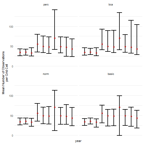
However, the question remains which interval types should be calculated and/or reported. A good idea is to compare different interval types next to each other together with the bootstrap distribution and the bootstrap bias (the difference between the estimate and the bootstrap estimate).
# Convert bootstrap replicates to dataframebootstrap_results_df <- boot_list_to_dataframe(  boot_list = bootstrap_results,  grouping_var = "year") %>%  mutate(year = as.numeric(year))
# Get bias valesbias_mean_obs <- bootstrap_results_df %>%  distinct(year, estimate = est_original, `bootstrap estimate` = est_boot)
# Get estimate valuesestimate_mean_obs <- bias_mean_obs %>%  pivot_longer(cols = c("estimate", "bootstrap estimate"),               names_to = "Legend", values_to = "value") %>%  mutate(Legend = factor(Legend, levels = c("estimate", "bootstrap estimate"),                         ordered = TRUE))# Visualisebootstrap_results_df %>%  ggplot(aes(x = year)) +  # Distribution  geom_violin(aes(y = rep_boot, group = year),              fill = alpha("cornflowerblue", 0.2)) +  # Estimates and bias  geom_point(data = estimate_mean_obs, aes(y = value, shape = Legend),             colour = "firebrick", size = 2, alpha = 0.5) +  # Intervals  geom_errorbar(data = ci_mean_obs,                aes(ymin = ll, ymax = ul, colour = int_type),                position = position_dodge(0.8), linewidth = 0.6) +  # Settings  labs(y = "Mean Number of Observations\nper Grid Cell",       x = "", shape = "Legend:", colour = "Interval type:") +  scale_x_continuous(breaks = sort(unique(bootstrap_results_df$year))) +  theme_minimal() +  theme(legend.position = "bottom",        legend.title = element_text(face = "bold"))#> Warning: Using shapes for an ordinal variable is not advised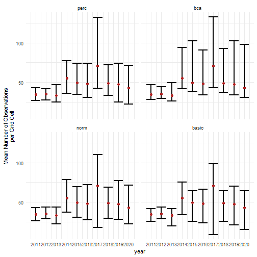
This informs us about the shape of the bootstrap distribution and the amount of bootstrap bias. In combination with bootstrap interval theory, it can be decided which interval type(s) should be reported. In general, because of the wide range of biodiversity indicator types, we recommend the use of percentile or BCa intervals, because they have no strong assumptions regarding the bootstrap distribution. The BCa interval is recommended as it accounts for bias and skewness. However, due to the jackknife estimation of the acceleration parameter, the calculation time is significantly longer. The use of the normal and basic confidence intervals is not recommended, but could be used in combination with truncations or transformations. The assumption of normality can be checked by making a Q-Q plot of the bootstrap replications (see further) (Davison & Hinkley, 1997). An overview of the recommendations is provided in the table below. This is not an exhaustive review of the topic, but based on existing literature and our preliminary results, these recommendations provide a useful starting point for selecting appropriate interval types.
| Interval type | Advantages | Disadvantages | References |
|---|---|---|---|
| Normal |
|
|
Davison & Hinkley (1997, Ch. 5); Efron & Tibshirani (1994, Ch. 13); Hesterberg (2015) |
| Basic |
|
|
Carpenter & Bithell (2000); Davison & Hinkley (1997, Ch. 5); Hesterberg (2015) |
| Percentile |
|
|
Carpenter & Bithell (2000); Davison & Hinkley (1997, Ch. 5); Efron & Tibshirani (1994, Ch. 13) |
| BCa |
|
|
Carpenter & Bithell (2000); Davison & Hinkley (1997, Ch. 5); Dixon (2000); Efron & Tibshirani (1994, Ch. 14) |
Smooth trends
Section titled “Smooth trends”To create a more continuous representation of change over time, we can apply LOESS (Locally Estimated Scatterplot Smoothing) to the estimates and confidence limits. This smoothing technique fits local regressions across subsets of the data, producing a flexible trend line that helps visualize broader patterns while retaining important details.
It should be noted that this may complicate interpretation of the results. Occurrence cubes are by definition categorical over time (in this case by year), so smoothing things out over time while the data have been aggregated might lead to different results compared to a similar analysis on the original data (before the cube was made and aggregation occurred). Therefore, we recommend this visualisation for long time series to make general interpretations of the trend over time. In our example, we actually have a small time frame so we only show this for the sake of the tutorial.
Based on the discussion above, we select the BCa interval as we see some asymmetry and bias in the bootstrap distribution of later years. Note that this is probably due to the selection 2000 random rows from the original dataset to reduce the computation time for this tutorial. Otherwise we would expect a more symmetrical distribution for this indicator.
ci_mean_obs %>% filter(int_type == "bca") %>% ggplot(aes(x = year, y = est_original)) + geom_smooth( colour = alpha("blue", 0.5), linetype = "solid", method = "loess", formula = "y ~ x", se = FALSE ) + geom_smooth( aes(y = ul), colour = alpha("lightsteelblue1", 1), linetype = "dashed", method = "loess", formula = "y ~ x", se = FALSE ) + geom_smooth( aes(y = ll), colour = alpha("lightsteelblue1", 1), linetype = "dashed", method = "loess", formula = "y ~ x", se = FALSE ) + geom_ribbon( aes(ymin = predict(loess(ll ~ year)), ymax = predict(loess(ul ~ year))), alpha = 0.2, fill = "lightsteelblue1" ) + # Intervals geom_errorbar(aes(ymin = ll, ymax = ul), position = position_dodge(0.8), linewidth = 0.8) + # Estimates geom_point(colour = "firebrick", size = 3) + # Settings labs(y = "Mean Number of Observations\nper Grid Cell") + scale_x_continuous(breaks = sort(unique(bootstrap_results$year))) + theme_minimal()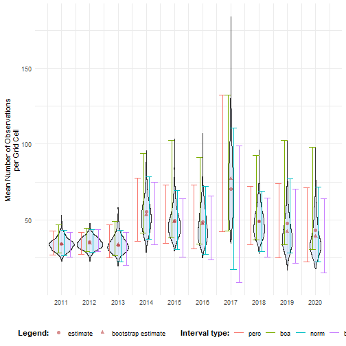
Fan plots
Section titled “Fan plots”The effectclass package provides the stat_fan() function to create fan plot intervals (see also this effectclass tutorial).
library(effectclass)These intervals are based on a normal distribution or a transformation via the link argument.
Therefore, we check the assumption of normality by making a Q-Q plot of the bootstrap replications.
ggplot(bootstrap_results_df, aes(sample = rep_boot)) + # Q-Q plot stat_qq() + stat_qq_line(col = "red") + # Settings labs(x = "Theoretical Quantiles (Standard Normal)", y = "Sample Quantiles (Bootstrap Replicates)") + facet_wrap(~ year, ncol = 2, scales = "free") + theme_minimal()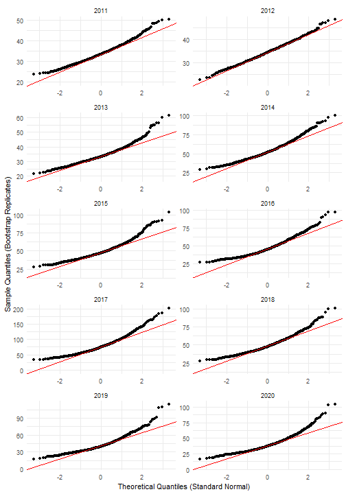
As expected, it looks like the bootstrap distributions are not normally distributed in most years. If we log-transform the bootstrap replications, the Q-Q plots look better.
ggplot(bootstrap_results_df, aes(sample = log(rep_boot))) + # Q-Q plot stat_qq() + stat_qq_line(col = "red") + # Settings labs(x = "Theoretical Quantiles (Standard Normal)", y = "Sample Quantiles (Bootstrap Replicates)") + facet_wrap(~ year, ncol = 2, scales = "free") + theme_minimal()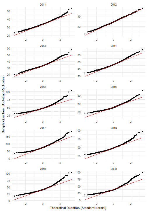
We therefore calculate the log-transformed normal intervals and compare them with the BCa and normal intervals.
ci_mean_obs_lognorm <- calculate_bootstrap_ci( bootstrap_results = bootstrap_results, grouping_var = "year", type = c("norm"), conf = 0.95, h = log, hinv = exp)The log-normal intervals look indeed more correct then the normal intervals, although they still differ from the BCa intervals.
# Combine interval dataci_mean_obs_new <- ci_mean_obs %>%  filter(int_type %in% c("bca", "norm")) %>%  bind_rows(    ci_mean_obs_lognorm %>%      mutate(year = as.numeric(year),             int_type = "log_norm")  )
# Visualisebootstrap_results_df %>%  ggplot(aes(x = year)) +  # Distribution  geom_violin(aes(y = rep_boot, group = year),              fill = alpha("cornflowerblue", 0.2)) +  # Estimates and bias  geom_point(data = estimate_mean_obs, aes(y = value, shape = Legend),             colour = "firebrick", size = 2, alpha = 0.5) +  # Intervals  geom_errorbar(data = ci_mean_obs_new,                aes(ymin = ll, ymax = ul, colour = int_type),                position = position_dodge(0.8), linewidth = 0.6) +  # Settings  labs(y = "Mean Number of Observations\nper Grid Cell",       x = "", shape = "Legend:", colour = "Interval type:") +  scale_x_continuous(breaks = sort(unique(bootstrap_results$year))) +  theme_minimal() +  theme(legend.position = "bottom",        legend.title = element_text(face = "bold"))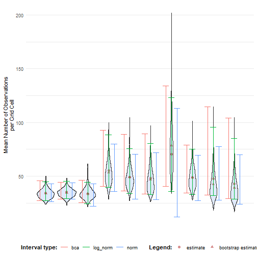
Finally, we can create a fan plot assuming the log-normal distribution.
Note that for stat_fan(), the link_sd is the standard error on the link scale, while y is on the natural scale.
So we have to recalculate the standard error on the log-transformed bootstrap replicates.
We also need to account for bias.
As noted in the previous section, year is a discrete variable in our data cube. We therefore use the geom = "rect" option.
bootstrap_results_df %>% # Calculate standard error on link scale mutate(rep_boot_log = log(rep_boot), est_boot_log = mean(rep_boot_log), # Needed for bias calculation se_boot_log = sd(rep_boot_log), .by = "year") %>% # Get unique estimates per year distinct(year, est_original, est_boot_log, se_boot_log) %>% # Calculate bias factor mutate(bias_log = exp(est_boot_log - log(est_original))) %>% # Visualise ggplot(aes(x = year)) + effectclass::stat_fan( aes(y = est_original / bias_log, link_sd = se_boot_log), link = "log", fill = "cornflowerblue", max_prob = 0.95, geom = "rect" ) + # Settings labs(y = "Mean Number of Observations\nper Grid Cell", x = "") + scale_x_continuous(breaks = sort(unique(bootstrap_results$year))) + theme_minimal()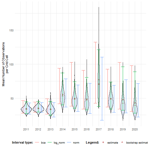
We can make use of this concept to make fan plots for other interval types ourselves. We calculate BCA and log-normal intervals for five coverages using a for loop.
# Set up coverage levelsmax_prob <- 0.95step <- 0.2coverages <- seq(max_prob, 1e-3, by = -step)
# Loop over coveragesout_ci_list <- vector(mode = "list", length = length(coverages))
for (i in seq_along(coverages)) {  cov <- coverages[i]
  # Calculate confidence limits for confidence level  ci_cov <- calculate_bootstrap_ci(    bootstrap_results = bootstrap_results,    grouping_var = "year",    type = c("bca", "norm"),    conf = cov,    h = log,    hinv = exp  )
  out_ci_list[[i]] <- ci_cov}out_ci <- bind_rows(out_ci_list) %>%  mutate(    year = as.numeric(year),    int_type = ifelse(int_type == "norm", "log_norm", int_type)  )
We can visualise this in a categorical way with geom_rect() from ggplot2.
# For visualisation of envelopesalpha_levels <- sapply(coverages, function(i) 1 - i / (i + step))names(alpha_levels) <- as.character(coverages)
# Convert conf to character so it can match alpha_levelsout_ci <- out_ci %>%  mutate(    conf_chr = as.character(conf),    year_num = as.numeric(as.factor(year)) # Numeric year for xmin/xmax  )
# Visualisebar_width <- 0.9
ggplot(out_ci, aes()) +  geom_rect(    aes(      xmin = year_num - bar_width / 2,      xmax = year_num + bar_width / 2,      ymin = ll,      ymax = ul,      fill = conf_chr,      alpha = conf_chr    )  ) +  # Colour ribbons  scale_alpha_manual(values = alpha_levels, name = "conf") +  scale_fill_manual(values = rep("cornflowerblue", length(alpha_levels)),                    name = "conf") +  # Settings  labs(y = "Mean Number of Observations\nper Grid Cell", x = "") +  scale_x_continuous(    breaks = unique(out_ci$year_num),    labels = unique(out_ci$year)  ) +  facet_wrap(~int_type, ncol = 1) +  theme_minimal()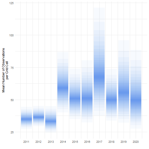
We can visualise this in a continuous way with geom_ribbon() from ggplot2.
Linear (like the default of stat_fan()):
ggplot(out_ci, aes(x = year)) + geom_ribbon(aes(ymin = ll, ymax = ul, fill = conf_chr, alpha = conf_chr)) + # Colour ribbons scale_alpha_manual(values = alpha_levels, name = "conf") + scale_fill_manual(values = rep("cornflowerblue", length(alpha_levels)), name = "conf") + # Settings labs(y = "Mean Number of Observations\nper Grid Cell", x = "") + scale_x_continuous(breaks = sort(unique(bootstrap_results$year))) + facet_wrap(~int_type, ncol = 1) + theme_minimal()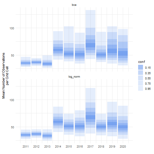
Smooth (like in the previous paragraph):
# Predict smooth ymin/ymaxout_ci %>% group_by(conf_chr, int_type) %>% mutate(ymin = predict(loess(ll ~ year)), ymax = predict(loess(ul ~ year))) %>% ungroup() %>% # Visualise ggplot(aes(x = year)) + geom_ribbon( aes(ymin = ymin, ymax = ymax, fill = conf_chr, alpha = conf_chr) ) + # Colour ribbons scale_alpha_manual(values = alpha_levels, name = "conf") + scale_fill_manual(values = rep("cornflowerblue", length(alpha_levels)), name = "conf") + # Settings labs(y = "Mean Number of Observations\nper Grid Cell", x = "") + scale_x_continuous(breaks = sort(unique(bootstrap_results$year))) + facet_wrap(~int_type, ncol = 1) + theme_minimal()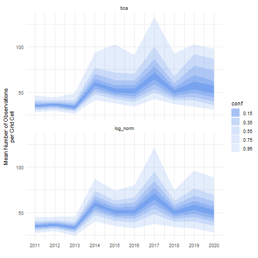
Visualising temporal effects
Section titled “Visualising temporal effects”In this tutorial, we demonstrated how to classify effect sizes based on confidence intervals. Here we give some visualisation options based on the effectclass package (see also this effectclass tutorial).
Let’s calculate the BCa interval for the mean number of observations per grid cell compared to 2011 and perform effect classification with threshold 5.
# Bootstrappingbootstrap_results_ref <- bootstrap_cube(  data_cube = processed_cube,  fun = mean_obs,  grouping_var = "year",  samples = 1000,  ref_group = 2011,  seed = 123)#> [1] "Performing whole-cube bootstrap."
# Calculate confidence intervalsci_mean_obs_ref <- calculate_bootstrap_ci(  bootstrap_results = bootstrap_results_ref,  grouping_var = "year",  type = "bca",  data_cube = processed_cube,   # Required for BCa  fun = mean_obs,               # Required for BCa  ref_group = 2011              # Required for BCa)#> Warning in norm_inter(h(t), adj_alpha): Extreme order statistics used as endpoints.#> Warning in norm_inter(h(t), adj_alpha): Extreme order statistics used as endpoints.
# Perform effect classificationresult <- add_effect_classification(  df = ci_mean_obs_ref,  cl_columns = c("ll", "ul"),  threshold = 5,  reference = 0)
# View the resultresult#>   year est_original    est_boot   se_boot  bias_boot int_type conf          ll       ul effect_code#> 1 2012    1.0942452  0.65831911  5.475053 -0.4359261      bca 0.95 -10.7621638 11.04344           ?#> 2 2013   -0.9219589 -0.07108256  6.690590  0.8508764      bca 0.95 -12.8513851 13.06589           ?#> 3 2014   21.2638321 19.32958556 10.982093 -1.9342466      bca 0.95   5.8187198 57.17064          ++#> 4 2015   15.0697689 14.80578656 10.723767 -0.2639823      bca 0.95   2.5039329 58.08685           +#> 5 2016   14.1628569 13.30622198 12.131657 -0.8566350      bca 0.95  -1.7552656 52.49345          ?+#> 6 2017   36.2442462 43.13141123 23.943155  6.8871650      bca 0.95   7.1906529 96.55713          ++#> 7 2018   14.6607335 14.98367972 10.715491  0.3229462      bca 0.95   0.3961534 48.95507           +#> 8 2019   13.2901788  8.46222485 13.048145 -4.8279539      bca 0.95  -0.5622564 69.67581          ?+#> 9 2020    8.8263369  5.37019562 13.084703 -3.4561413      bca 0.95  -5.3273172 65.47783           ?#>   effect_code_coarse             effect effect_coarse#> 1                  ?            unknown       unknown#> 2                  ?            unknown       unknown#> 3                  +    strong increase      increase#> 4                  +           increase      increase#> 5                  ? potential increase       unknown#> 6                  +    strong increase      increase#> 7                  +           increase      increase#> 8                  ? potential increase       unknown#> 9                  ?            unknown       unknown
The effectclass package provides the stat_effect() function that visualises the effects with colours and symbols.
ggplot(data = result, aes(x = year, y = est_original, ymin = ll, ymax = ul)) + effectclass::stat_effect(reference = 0, threshold = 5) + # Settings labs(y = "Mean Number of Observations\nper Grid Cell Compared to 2011", x = "") + scale_x_continuous(breaks = sort(unique(result$year))) + theme_minimal()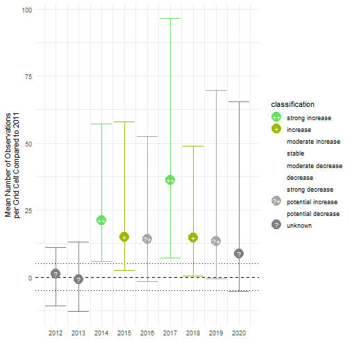
With this function, you can also add symbols to stat_fan().
Note that the choice of the reference year should be well considered. Keep in mind which comparisons should be made, and what the motivation is behind the reference period. A high or low value in the reference period relative to other periods, e.g. an exceptional bad or good year, can affect the magnitude and direction of the calculated differences. Whether this should be avoided or not, depends on the motivation behind the choice and the research question. A reference period can be determined by legislation, or by the start of a monitoring campaign. A specific research question can determine the periods that need to be compared. Furthermore, the variability of the estimate of reference period affects the width of confidence intervals for the differences. A more variable reference period will propagate greater uncertainty. In the case of GBIF data, more data will be available in recent years than in earlier years. If this is the case, it could make sense to select the last period as a reference period. In a way, this also avoids the arbitrariness of choice for the reference period. You compare previous situations with the current situation (last year), where you could repeat this comparison annually, for example. Finally, when comparing multiple indicators, we recommend using a consistent reference period to maintain comparability
References
Section titled “References”Carpenter, J., & Bithell, J. (2000). Bootstrap confidence intervals: When, which, what? A practical guide for medical statisticians. Statistics in Medicine, 19(9), 1141–1164. https://doi.org/10.1002/(SICI)1097-0258(20000515)19:9<1141::AID-SIM479>3.0.CO;2-F
Davison, A. C., & Hinkley, D. V. (1997). Bootstrap Methods and their Application (1st ed.). Cambridge University Press. https://doi.org/10.1017/CBO9780511802843
Dixon, P. M. (2001). The Bootstrap and the Jackknife: Describing the Precision of Ecological Indices. In S. M. Scheiner & J. Gurevitch (Eds.), Design and Analysis of Ecological Experiments (Second Edition, pp. 267–288). Oxford University PressNew York, NY. https://doi.org/10.1093/oso/9780195131871.003.0014
Efron, B., & Tibshirani, R. J. (1994). An Introduction to the Bootstrap (1st ed.). Chapman and Hall/CRC. https://doi.org/10.1201/9780429246593
Hesterberg, T. C. (2015). What Teachers Should Know About the Bootstrap: Resampling in the Undergraduate Statistics Curriculum. The American Statistician, 69(4), 371–386. https://doi.org/10.1080/00031305.2015.1089789