Additional Mapping and Visualisation Examples
This vignette provides additional examples for visualising and interpreting dissmapr outputs. It is designed as a practical gallery of common plotting and summary tasks that can help users explore biodiversity patterns after running the main workflow.
To keep the example reproducible and quick to run, we use a small set of example objects bundled with dissmapr. The setup chunk below loads the required packages, reads the bundled data snapshot, and unpacks the species, boundary, and helper objects needed for the visualisation examples.
# Load the packages used in this vignette.library(ggplot2)library(dplyr)library(viridis)library(dissmapr)
# Load the bundled example data snapshot.inputs = readRDS(system.file("extdata", "dissmapr_vignettes.rds", package = "dissmapr"))
# Unpack the example objects used below.grid_spp = inputs$grid_spp # Grid-level species datasp_cols = inputs$sp_cols   # Species column namesrsa = inputs$rsa           # South Africa boundary
Analysis of Species Richness and Community Turnover
Section titled “Analysis of Species Richness and Community Turnover”Below we demonstrate how to quantify biodiversity patterns using two common ecological metrics: species richness and community turnover (beta diversity). Both analyses utilize the compute_orderwise() function from the dissmapr package, applying the metric functions richness() and turnover() respectively, to spatial biodiversity data organised in the grid_spp dataset.
Example 1 - Species Richness using richness()`
Section titled “Example 1 - Species Richness using richness()`”Here we calculate species richness across sites in the block_sp dataset, using the compute_orderwise() function. The richness() metric function is applied to the grid_id column for site identification, with species data specified by sp_cols. Orders 1 to 4 are computed i.e. for order=1, it computes basic species richness at individual sites, while higher orders (2 to 4) represent the differences in richness between pairwise and/or multi-site combinations. A subset of 1000 samples is used for higher-order computations to speed-up computation time. Parallel processing is enabled with 4 worker threads to improve performance. The output is a table summarizing species richness across specified orders.
# Compute species richness (order 1) and the difference thereof for orders 2 to 4rich_o1234 = dissmapr::compute_orderwise(  df = grid_spp,  func = richness,  site_col = 'grid_id',  sp_cols = sp_cols,  sample_no = 1000,  order = 1:4,  parallel = TRUE,  n_workers = 4)
# Check resultshead(rich_o1234)#>    site_from site_to order value#>       <char>  <char> <int> <int>#> 1:      1026    <NA>     1     2#> 2:      1027    <NA>     1    31#> 3:      1028    <NA>     1    10#> 4:      1029    <NA>     1     7#> 5:      1030    <NA>     1     6#> 6:      1031    <NA>     1    76
# Plot species richness distribution by orderboxplot(sqrt(value) ~ order, data = rich_o1234, col = c('#4575b4', '#99ce8f', '#fefab8', '#d73027'), horizontal = TRUE, outline = FALSE, main = 'Distribution of √Species Richness by Order')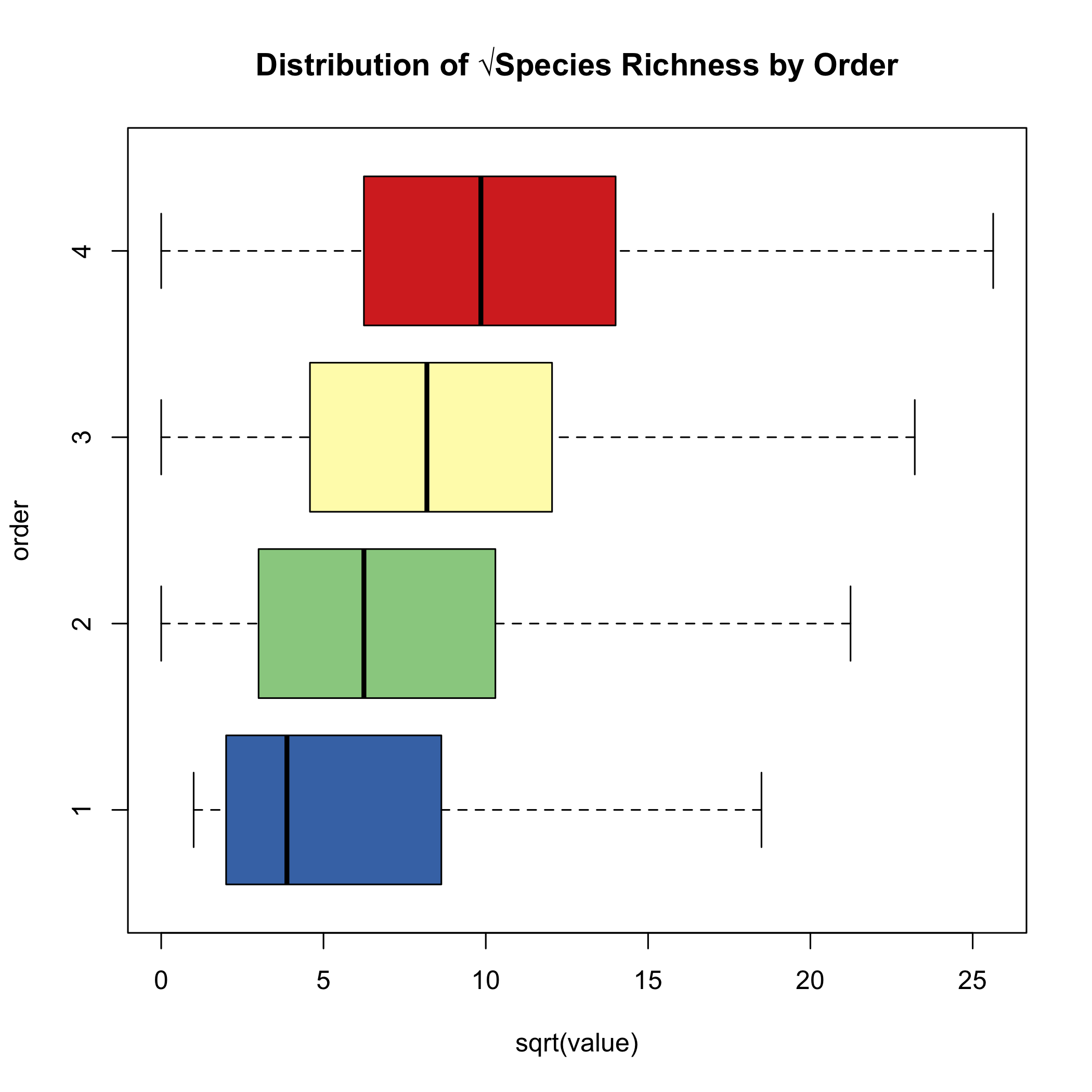
# Link centroid coordinates back to `rich_o1234` data.frame for plottingrich_o1234$centroid_lon = grid_spp$centroid_lon[match(rich_o1234$site_from, grid_spp$grid_id)]rich_o1234$centroid_lat = grid_spp$centroid_lat[match(rich_o1234$site_from, grid_spp$grid_id)]
# Summarise turnover by site (spatial location)mean_rich_o1234 = rich_o1234 %>%  group_by(order, site_from, centroid_lon, centroid_lat) %>%  summarize(value = mean(value, na.rm = TRUE))
# Check resultshead(mean_rich_o1234)#> # A tibble: 6 × 5#> # Groups:   order, site_from, centroid_lon [6]#>   order site_from centroid_lon centroid_lat value#>   <int> <chr>            <dbl>        <dbl> <dbl>#> 1     1 1026              28.8        -22.3     2#> 2     1 1027              29.2        -22.3    31#> 3     1 1028              29.7        -22.3    10#> 4     1 1029              30.3        -22.3     7#> 5     1 1030              30.8        -22.3     6#> 6     1 1031              31.3        -22.3    76
# Plot Richness calculated using `compute_orderwise(..., func = richness, ...)`ggplot() + geom_tile(data = mean_rich_o1234[mean_rich_o1234$order==1,], aes(x = centroid_lon, y = centroid_lat, fill = sqrt(value))) + scale_fill_gradientn(colors = viridis(8)) + #Apply viridis color palette geom_sf(data = rsa, fill = NA, color = "black", alpha = 0.5) + theme_minimal() + labs(x = "Longitude", y = "Latitude", fill = "√Species Richness") + theme(panel.grid = element_blank(),panel.border = element_blank() )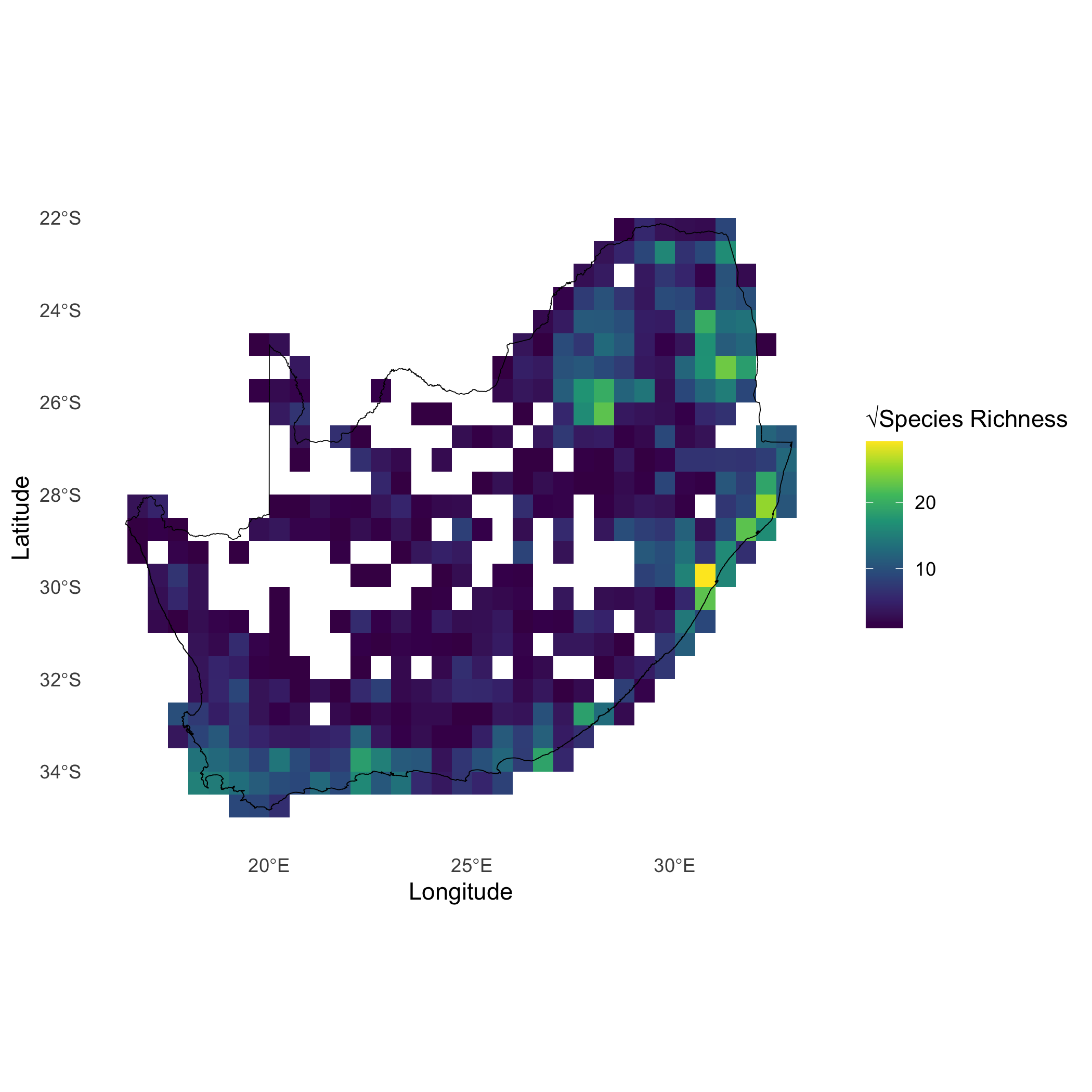
Plot order-wise richness (orders 2:5) calculated using compute_orderwise(..., func = richness, ...) to visualise spatial patterns of richness across different orders. Results highlight regions of high or low richness compared across orders.
# Plot order-wise richness (orders 2:5) calculated using `compute_orderwise(..., func = richness, ...)`ggplot() + geom_tile(data = mean_rich_o1234, aes(x = centroid_lon, y = centroid_lat, fill = sqrt(value))) + scale_fill_viridis_c(option = "turbo", name = "Richness") + geom_sf(data = rsa, fill = NA, color = "black", alpha = 0.5) + theme_minimal() + labs( title = "Mean √Richness by Order", x = "Longitude", y = "Latitude" ) + facet_wrap(~ order, ncol = 2)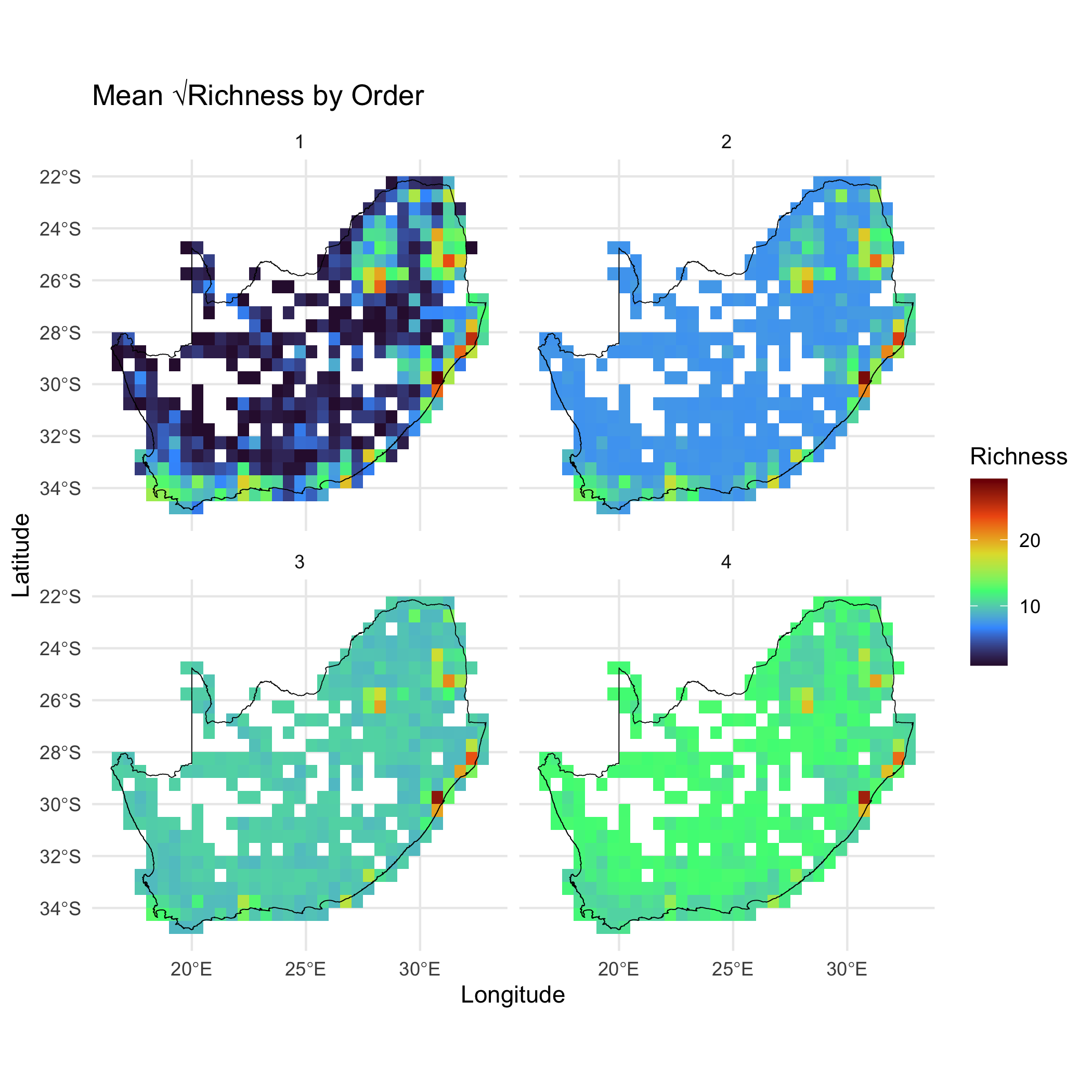
Example 2 - Community Turnover using turnover()
Section titled “Example 2 - Community Turnover using turnover()”Here we calculate species turnover (beta diversity) across sites in the block_sp dataset using the compute_orderwise() function again. The turnover() metric function is applied to the grid_id column for site identification, with species data specified by sp_cols. Order = 1 is not an option because turnover requires a comparison between sites. For orders 2 to 5, it computes turnover for pairwise and higher-order site combinations, representing the proportion of species not shared between sites. A subset of 1000 samples is used for higher-order comparisons. Parallel processing with 4 worker threads improves efficiency, and the output is a table summarizing species turnover across the specified orders.
# Compute community turnover for orders 2 to 5turn_o2345 = dissmapr::compute_orderwise(  df = grid_spp,  func = turnover,  site_col = 'grid_id',  sp_cols = sp_cols, # OR `names(grid_spp)[-c(1:4)]`  sample_no = 1000, # Reduce to speed-up computation  order = 2:5,  parallel = TRUE,  n_workers = 4)
# Check resultshead(turn_o2345)#>    site_from site_to order     value#>       <char>  <char> <int>     <num>#> 1:      1027    1026     2 0.9354839#> 2:      1028    1026     2 0.9090909#> 3:      1029    1026     2 1.0000000#> 4:      1030    1026     2 1.0000000#> 5:      1031    1026     2 0.9870130#> 6:       117    1026     2 1.0000000
To visualize the spatial patterns of turnover across sites, geographic coordinates are added back to the results. This allows spatial exploration of turnover patterns across different orders, highlighting regions of high or low turnover and enabling comparisons across orders. These visualizations provide valuable insights into spatial biodiversity dynamics. Below we assign the geographic coordinates (x and y) from the block_sp dataset to the turn_o2345 results. Using match, it aligns the coordinates to the site_from column in turn_o2345 based on the corresponding grid_id values in block_sp. This prepares the dataset for spatial plotting.
# Add coordinates back to 'turn_o2345' for plottingturn_o2345$centroid_lon = grid_spp$centroid_lon[match(turn_o2345$site_from, grid_spp$grid_id)]turn_o2345$centroid_lat = grid_spp$centroid_lat[match(turn_o2345$site_from, grid_spp$grid_id)]
# Summarise turnover by site (spatial location)mean_turn_o2345 = turn_o2345 %>%  group_by(order, site_from, centroid_lon, centroid_lat) %>%  summarize(value = mean(value, na.rm = TRUE))
# Plot Beta Diversity (pairwise turnover i.e. only order 2) calculated using `compute_orderwise(..., func = turnover, ...)`ggplot() +  geom_tile(data = mean_turn_o2345[mean_turn_o2345$order==2,],            aes(x = centroid_lon, y = centroid_lat, fill = value)) +  scale_fill_gradientn(colors = viridis(8)) + #Apply viridis color palette  geom_sf(data = rsa, fill = NA, color = "black", alpha = 0.5) +  theme_minimal() +  labs(x = "Longitude", y = "Latitude", fill = "Beta Diversity") +  theme(panel.grid = element_blank(),panel.border = element_blank()  )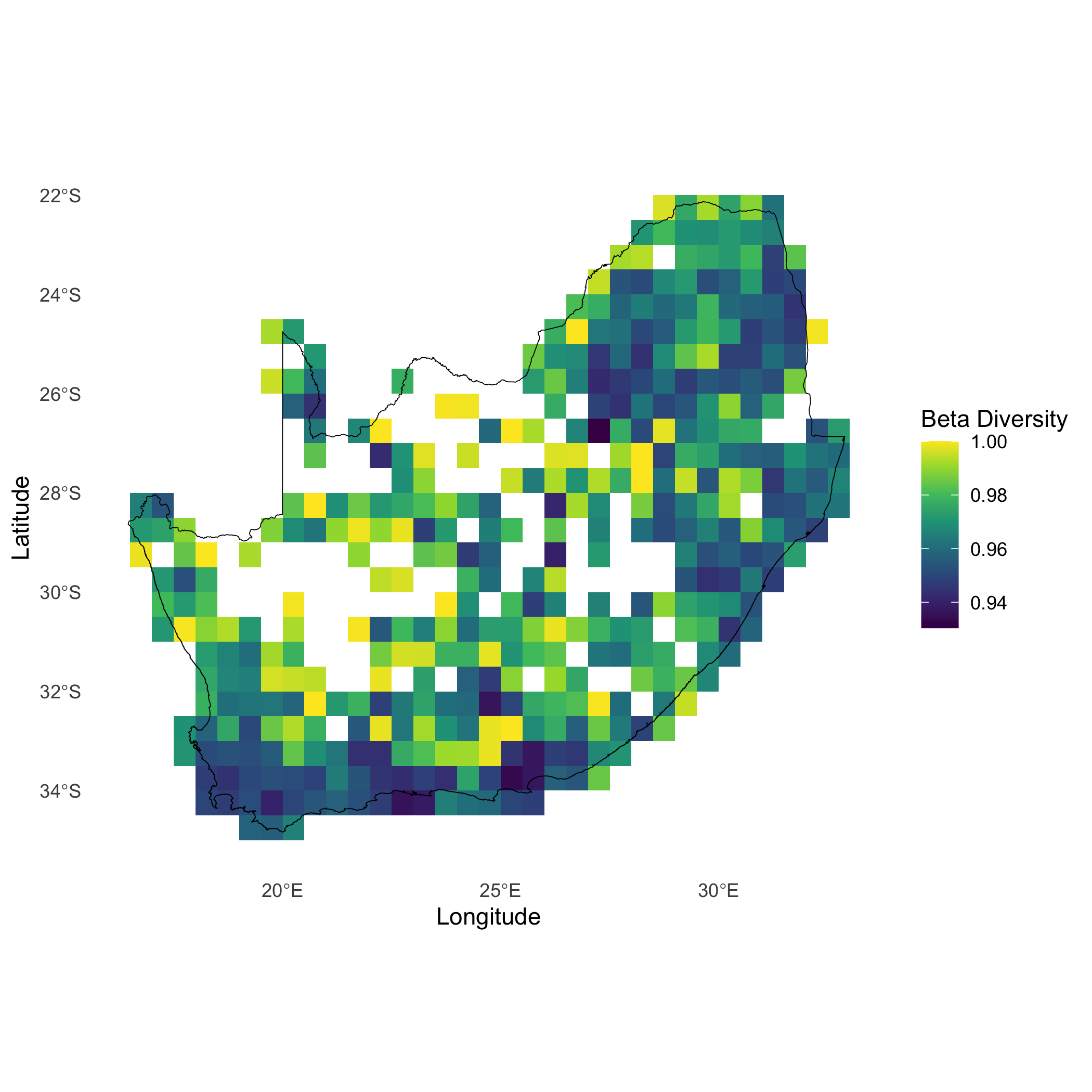
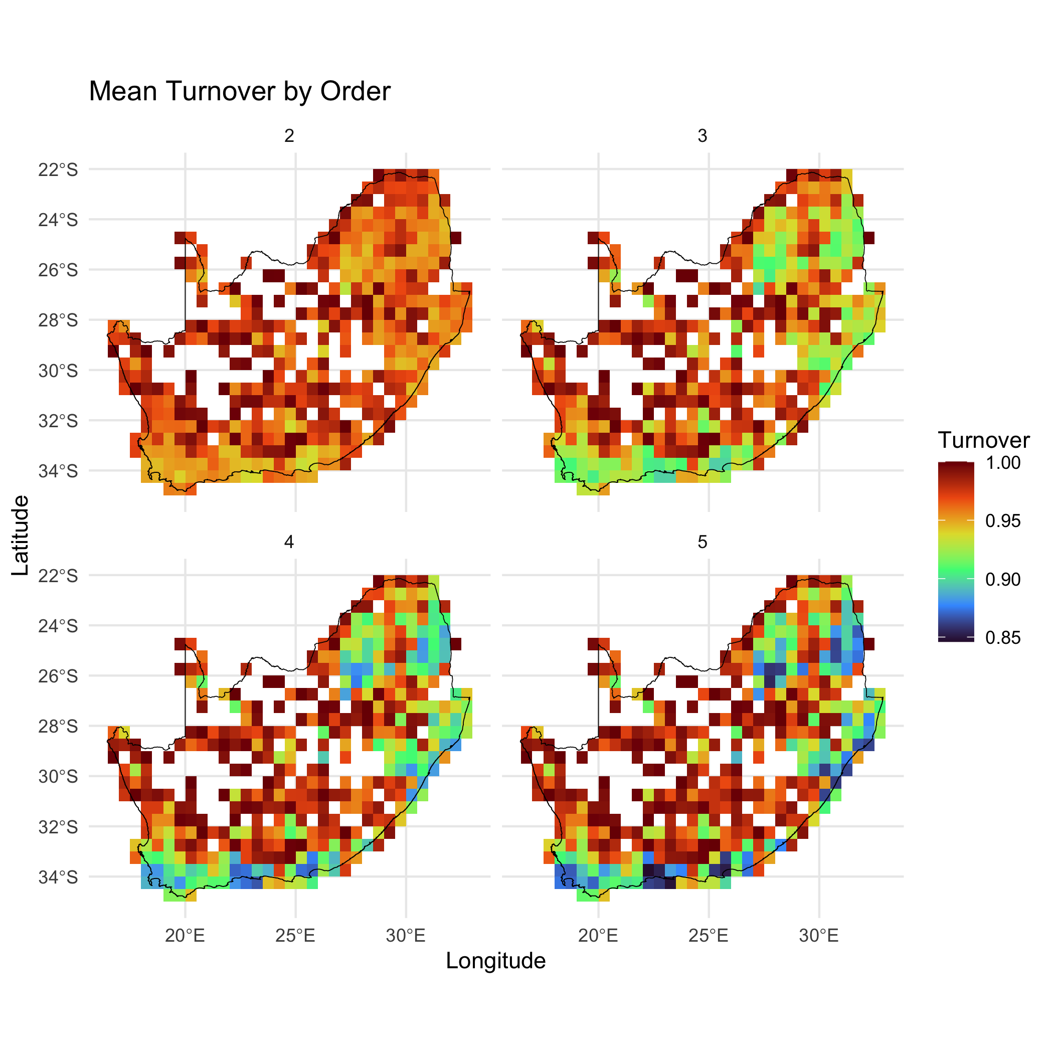
Plot order-wise turnover (orders 2:5) calculated using compute_orderwise(..., func = turnover, ...) to visualise spatial patterns of turnover across different orders. Results highlight regions of high or low turnover and facilitate comparison across orders, providing insights into spatial biodiversity dynamics.
# Plot order-wise turnover (orders 2:5) calculated using `compute_orderwise(..., func = turnover, ...)`ggplot() + geom_tile(data = mean_turn_o2345, aes(x = centroid_lon, y = centroid_lat, fill = value)) + scale_fill_viridis_c(option = "turbo", name = "Turnover") + geom_sf(data = rsa, fill = NA, color = "black", alpha = 0.5) + theme_minimal() + labs( title = "Mean Turnover by Order", x = "Longitude", y = "Latitude" ) + facet_wrap(~ order, ncol = 2)